ENIBRAND
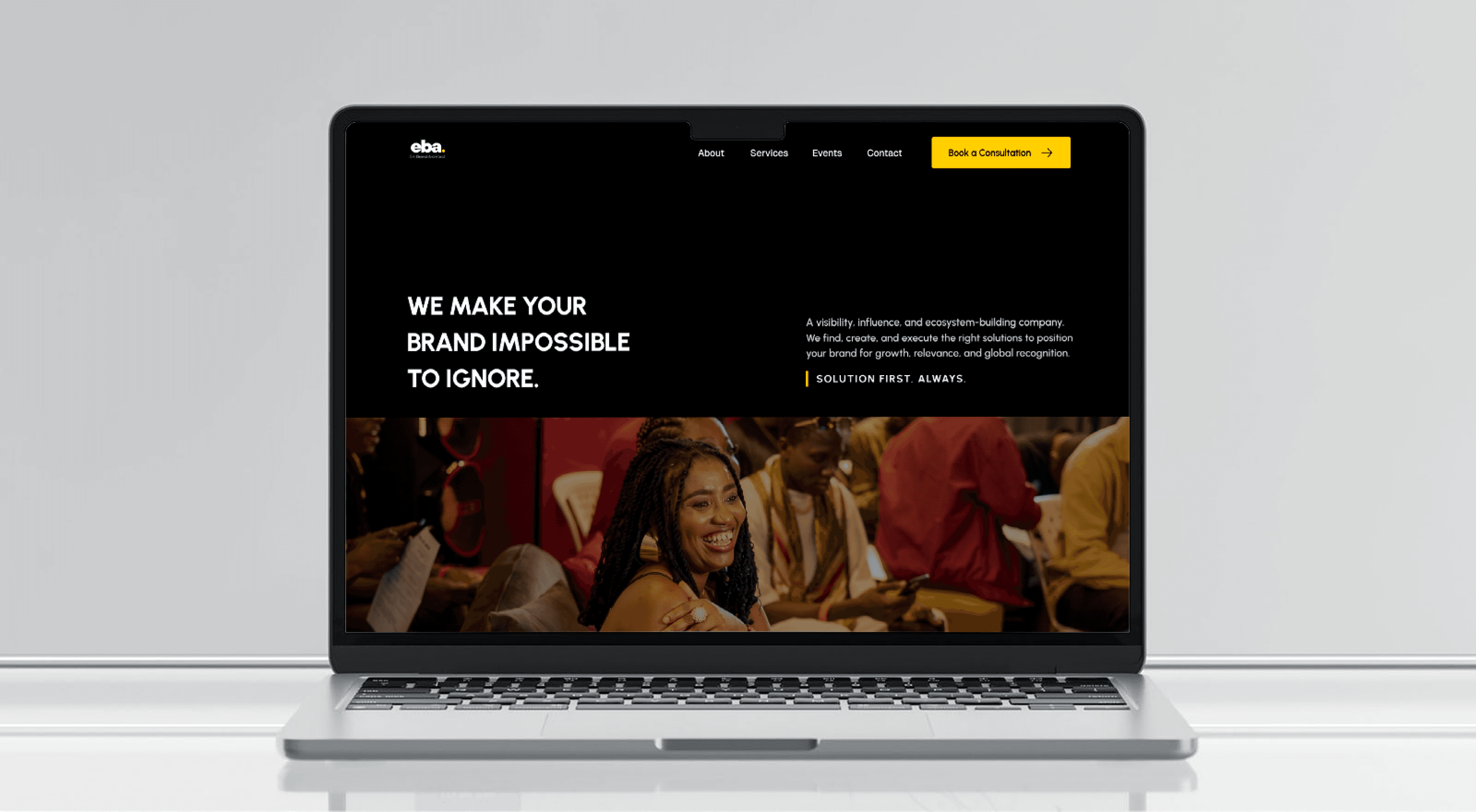
A homepage redesign that turns a cluttered PR agency site into a premium, client-winning presence.
Why
redesign
Because trust is visual.
Corporate clients judge a PR agency by its own presence. I led the redesign end to end , research, style guide, high-fidelity responsive UI.
The old homepage lowered the agency's standing.
Cluttered, disorganized, no clear palette. Clients couldn't trust it, so they didn't reach out.
A strict, minimal identity that projects quiet authority.
One palette, one type scale, a spacious grid, scattered information becomes scannable trust.
Play the prototype →From chaos to clarity
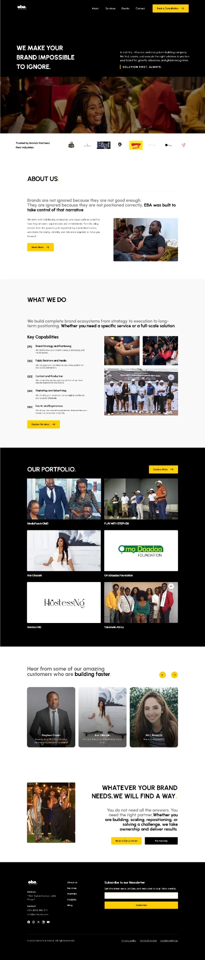
Both homepages at full length, in the same frame. Hover to play a page through, or scroll inside it yourself.

Four decisions did the heavy lifting
A strict style guide
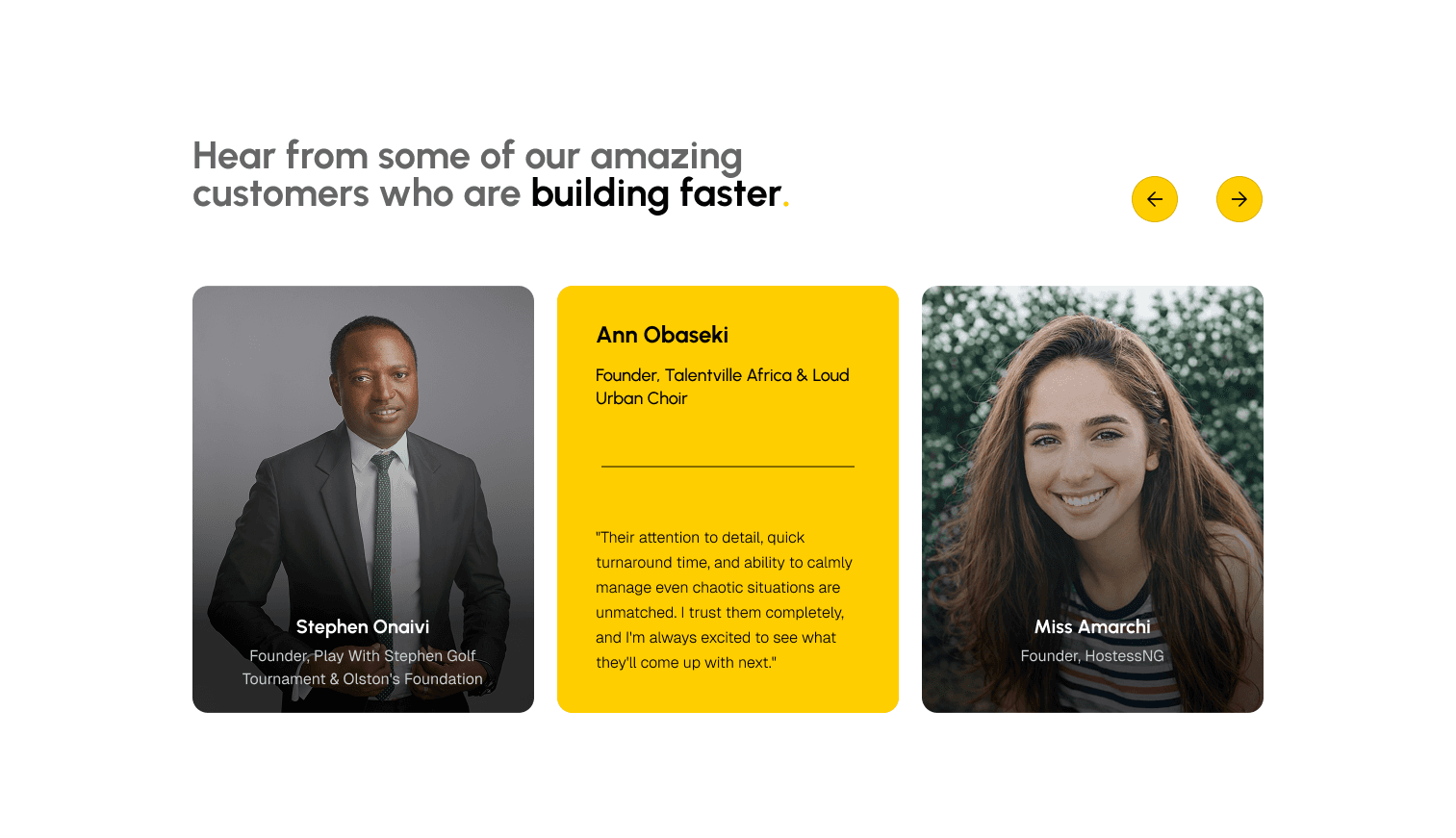
Users called the old site “unpolished.” One high-contrast palette and a structured type scale replaced confusion with instant credibility.
Social proof above the fold
Clients ask one thing first: “who trusted you?” A Trusted-By banner right under the hero answers it in seconds.
Whitespace over clutter
Core services were buried in text blocks. A clean grid with generous whitespace breaks the page into scannable sections.
Four tabs, one CTA
Contact was lost in dropdowns. The nav shrank to 4 tabs with a persistent “Book a Consultation” always one click away.


The system behind it
Heading font
Testing killed my extra scroll animations, restraint kept the premium tone.
Defining colors and type before layout saved hours of iteration.
The best UX came from stripping clutter, not new features.
YOU